VIRGIN WINES VOUCHER REDEMPTION
Redesigning the user flow of voucher redemption, aiming to improve conversion of new users into regular customers
OUTCOMES

STARTING THE PROJECT
The beginning of the project started with a presentation by a Virgin Wines representative on what issues they are facing with their voucher redemption flow, and the task they were setting us in order to resolve the issues. This led into receiving a brief for the project, analysing it in depth and creating a timeframe via Miro.
RESEARCH STRATEGY
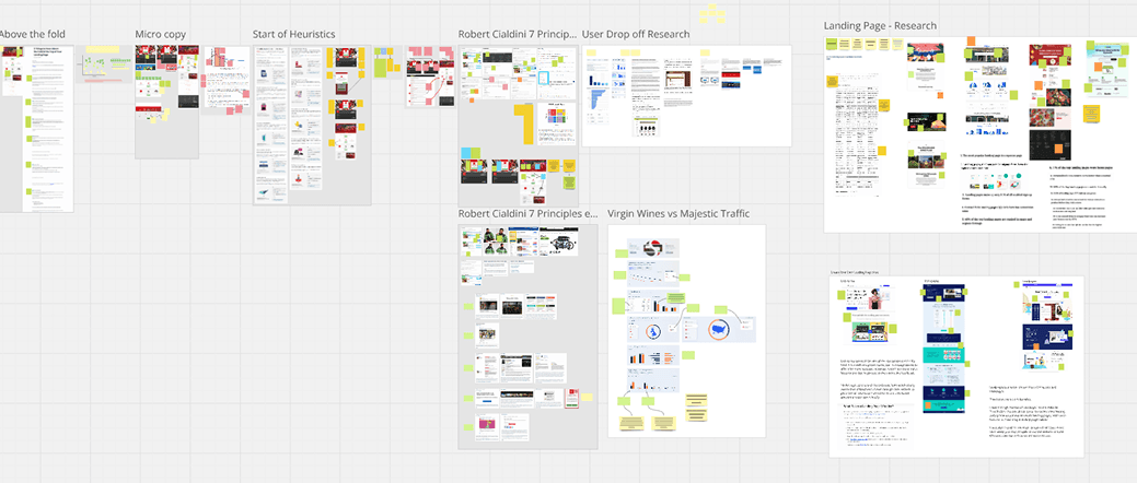
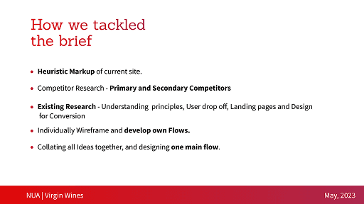
Early stages of the project began with an analysis of the brief we had recieved, and analysing the existing flow of the system. Each stage of the voucher redemption flow of the site was given a heuristic markup in order to detect the flaws in the site and where the struggle points that may end a users journey were. Using coloured notes and a traffic light system, sections were highlighted on what we thought were effective, concerning or in need of changing.

As we worked in a group for this project, each of us did our own seperate analysis of the site, then combining all our research findings together in one place, collecting a range of thoughts and issues with the current flows

As we worked in a group for this project, each of us did our own seperate analysis of the site, then combining all our research findings together in one place, collecting a range of thoughts and issues with the current flow.
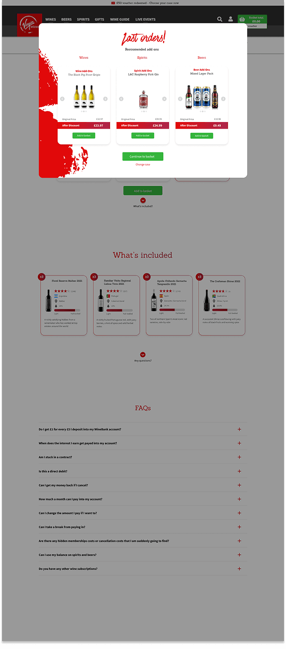
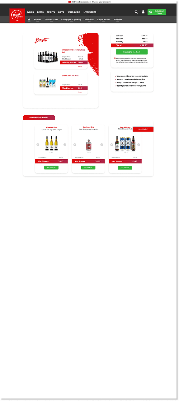
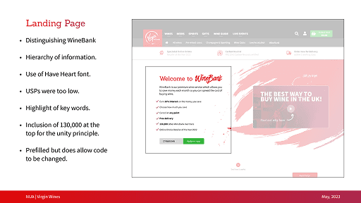
This research allowed us to discover a variety of weak points within the way Virgin Wines incorporated vouchers into its flow, with a major system in Winebank being hidden from the user upon using the voucher for a discounted wine case. This system caused users to unknowingly sign up for a repeat subscription in order to deposit funds into a bank exclusivly for buying wines, that recieves a high interest rate. Many of the users complaints about the site came from this system, so streamlining it and providing better communication became a key aspect and focus of the redesign.
GENERATING IDEAS
Before developing a design for the website, we first conducted a series of user tests to discover what the key, important USPs were for users interested in the Virgin Wines brand.
This research was key for us to learn exactly what should be prioritised in being highlighted for a customer when being introduced to the brand and what makes it stand out as unique.

As we worked in a group for this project, each of us did our own seperate analysis of the site, then combining all our research findings together in one place, collecting a range of thoughts and issues with the current flows
TEAM PLANNING
As each member of the team had focused their research on different areas of the project, and an upcoming tight deadline, each of us focused on a different page. This allowed us to focus our efforts and thoughts into high quality outcomes, with consistent communication between each other to share thoughts and feedback to ensure all designs followed the same design style.
This was done via a team effort deciding specific colours, font and sizes for elements based upon the original Virgin Wines brand design principles

DEVELOPMENT
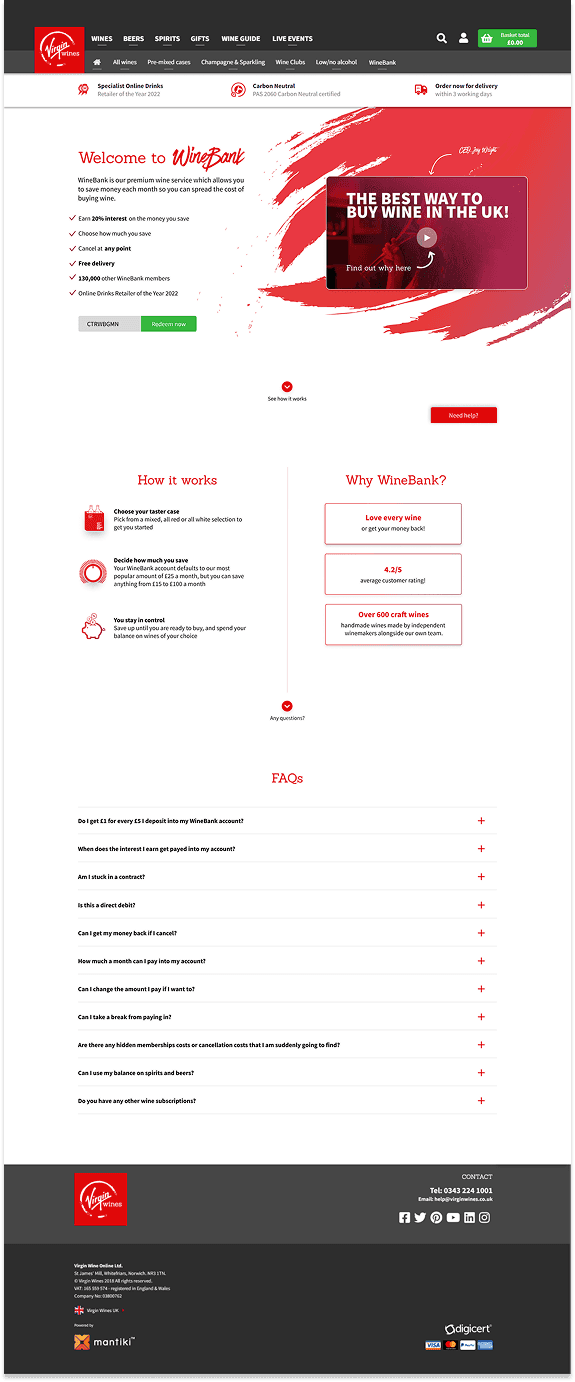
Designing the Winebank introduction page as my focus area in the group, I wanted to put a priority on clear and concise communication to the customer, clearly showing to them what it was they were signing up for, and putting high priority into the USPs of the system, giving the user a reason to be interested in this unique system.
These ideas were gained from the research and user interviews earlier in the project, as many respondants were unsure about the key selling points of the brand, with other online reviews having been accidentally misinformed by their expectations and lack of a clear explanation.


PRESENTING TO THE CLIENT
With the designs refined to a stage suitable for showcase, the group then proceeded to work on creating a presentation for our design. This presentation was created together with each designer creating slides on their specific area of focus, using a variety of design and font styles to remain consistent in design throughout.
Within the presentations itself, the designs of the old version was directly compared to the proposed redesign, highlighting the strengths and benefits each change would bring, including the research behind each change.


FINAL THOUGHTS
Being the first professional project I had worked on with a client, the Virgin Wines redesign helped me to understand key elements of working with a team, including how to manage time and tasks within a team with team organisation programs, as well as how to communicate ideas and feedback to team members to elevate the project to a higher level.
Working with a client also taught me how to approach dealing with having limited and brief time to ask questions and recieve client feedback on a design direction, leading to a higher area of planning to ensure time spent with them is made as valuable as possible.
Overall the project was very enjoyable and not only developed my interpersonal skills, but also my general UX design skills with a higher emphasis on researching theory and principles in the early project phases.